May we be larger than ourselves
. . .
Hi, Thais here. I believe empathy and radical generosity are key to fixing our world, so I’m on a mission to learn to live less for myself and more for others.
I believe design can help me get there. That’s why I spend my time helping teams of passionate people identify problems worth solving, quickly prototype & test solutions and design meaningful experiences that impact other humans.
Scroll down to learn about my work, then be sure to say hi.
Case Study #1
Using Lean Startup to uncover new ways of helping Creatives
. . .

FreshBooks challenged my team to dream up new features that would entice more Creative Professionals to become paying customers of its Cloud Accounting solution.
That was the business problem. But we wanted to start with the user. We believed our best bet was to find a problem Creatives were so eager to have solved they’d be willing to pay for a solution (a win for the customer and the business).
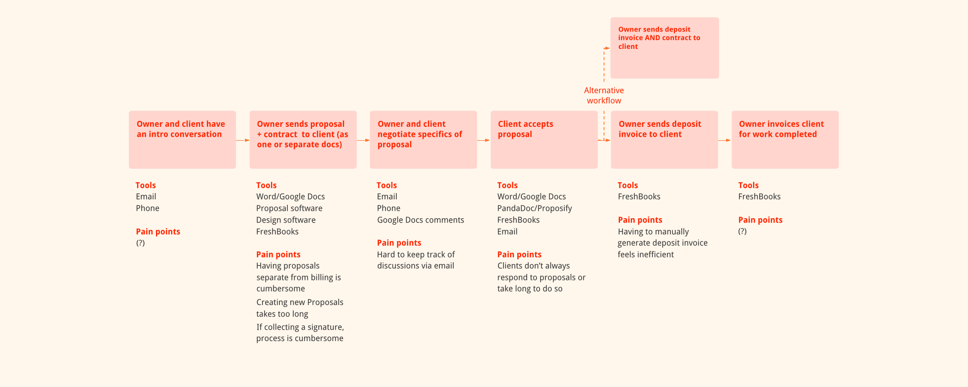
We had heard from another team that Creatives were frustrated with FreshBooks’ Estimates feature. It didn’t give them room to sell prospective clients on their value, so they ended up using other tools to create more robust and engaging documents they often referred to as Proposals. Based on this insight, we arrived at a hypothesis:
Our hypothesis was a risky one. Allowing users to create proposals could be a lot of work—entire products are built for that purpose alone! So how could we de-risk it?
For that, we turned to Lean Startup: a practice for minimizing waste in the creation of new products by going through a cycle of building, measuring results and learning.
Lean Startup recommends capturing your assumptions (about the problem, audience and other aspects of your product) then trying to validate them in the leanest way possible.
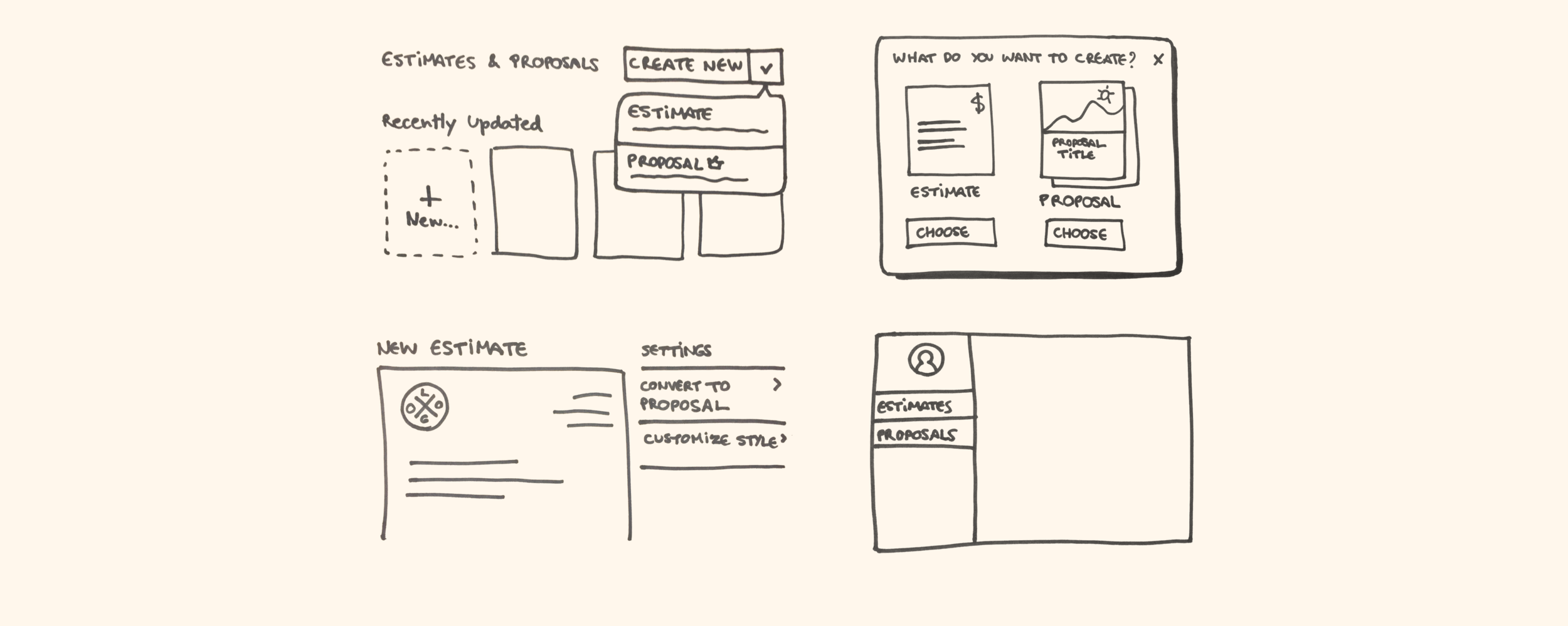
After writing down our assumptions as a team, I used a quick prototype of the feature (started by a colleague and refined by me) to interview potential users:
The interviews revealed we were on the right track, so we felt confident we should build an MVP of Proposals. I spent the next few weeks flushing out designs and working with developers to build out the feature.
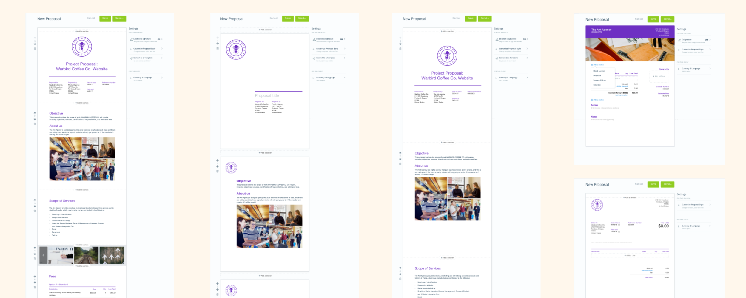
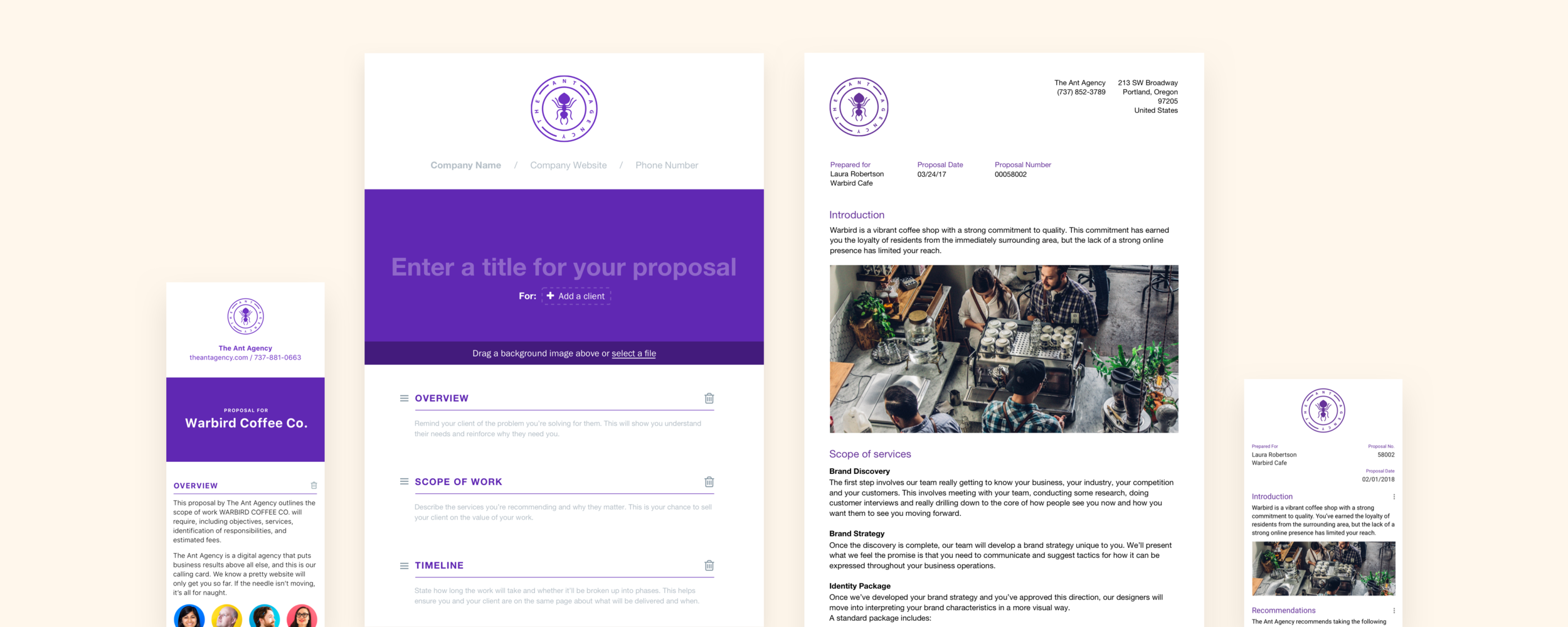
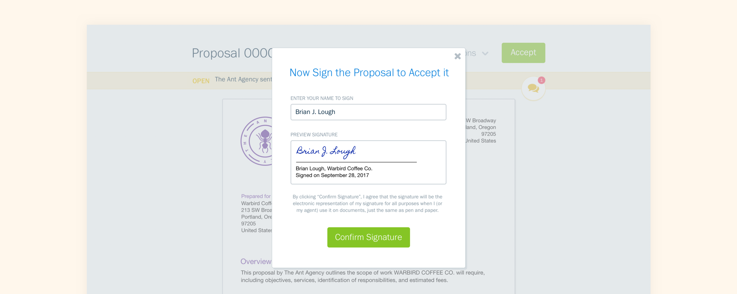
Here are some highlights from my process and some screenshots of the final experience:
Proposals officially launched in late 2017. I left FreshBooks shortly after, but by then we had leading indicators that customers who used the feature were more likely to upgrade to a paid plan and we had received very positive feedback from many Creatives (and even folks from who we didn’t expect to to use the feature, like Tradespeople).

Case Study #2
Navigating cross-platform design with React Native at The Knot
. . .

Wedding professionals all over US use The Knot Pro to manage their listing on The Knot (the country’s largest source for wedding news and inspiration).
When I joined The Knot, Pros didn’t yet have the ability to manage their listing from a mobile device, which prevented them from keeping it as up-to-date as possible.
I was tasked with designing the mobile experience for managing The Knot listings (aka: Storefronts). I also took the opportunity to suggest UX improvements that we could later carry over to the web.
One of the first things I tackled was revisiting the information architecture of the Storefront tab, so that the content was organized in a more intuitive way and with clearer labels. Here’s a comparison of the existing structure and what I proposed:

As you can see, there was a lot of content inside of “General Info“ (which is a pretty vague label) so I suggested we split that up into different sections. “Other Details“ also didn’t accurately represent its contents (a list of products and services the Pro offers), so I suggested we tweak that label too.
To ensure the groupings I suggested were intuitive, I ran usability tests with our customers and consulted with our customer support and taxonomy teams.
We knew that Pros like to tweak their galleries often, so we wanted to allow them to reorder the photos in their gallery. These sketches show a few of the approaches I explored:

Another unique aspect of this project is that The Knot Pro app was built using React native (a framework that lets you write an app once but run it natively on both iOS and Android).
Working with React Native brings a series of interesting design challenges, like deciding how much you want your UI to be shared between iOS and Android.
Another challenge is accounting for system differences between the two platforms. For example, I learned that in iOS you can only use a native alert to request access to your users’ photos once. If they say no, in future instances you’ll have to ask them to go to their settings to give you access. However, in Android you can trigger the native permissions modal as many times as needed, so you won’t have to direct users to their settings.

I was the first designer at the company to face these challenges, so I eventually led the effort to formalize our approach to cross-platform design.
You can learn more about my experience with React Native on Medium.
Case Study #3
Using design principles to create notifications that don't suck
. . .

FreshBooks helps small business owners keep all their billing documents (like invoices, estimates and expense receipts) in one place.
However, owners often have conversations about these documents with their clients outside of FreshBooks, such as by email. This makes it harder for owners to keep track of important information about their billing.
To solve this problem, FreshBooks asked my team and I to design a way for owners to have conversations with their clients about their documents right in FreshBooks.
In FreshBooks, each document already included a dedicated area showing the document’s current status as well as actions taken by different parties on that document (e.g. “You sent this invoice to John”, “John viewed this invoice”).
I worked on modifying the document history area to accommodate conversations and designed the experience of messaging someone from the document.
Here’s the desktop view of what the history area looked like after I incorporated messaging into it:

Along with allowing owners to keep their conversations in FreshBooks came a responsibility to ensure they don’t miss important messages from their clients (and vice-versa).
But what should we notify users about and through which medium (email, push, in-app…)? To help my team answer that question, I designed and a ran a 1:1 research exercise with several business owners.
I’d ask each owner to imagine they just hired a personal assistant whose sole job was to keep them updated on their business.
Now they had to arrange cards on a Trello board under the column that corresponded to how they wanted the assistant to communicate various updates to them:

As owners sorted the cards under each column, I’d ask them why they sorted it that way—the most important part of the exercise.
Our goal was not to create one precious and final list of notifications. Instead, we hoped to uncover what makes an update more or less important to users, then use that information to create guiding principles for FreshBooks notifications.
For instance, we observed that owners cared most about updates from people in their network, say…a client asked them a question on an Estimate or an employee needed help with a project. Owners care a lot about their relationship with those people and don’t want to leave them hanging. So one of our principles was:
With the principles defined, I moved on to designing the visual style and interaction for our notifications. Some of the decisions I had to drive included:
Where should notifications appear in FreshBooks?
I recommended that they be placed within the global side navigation on web and within the top bar on mobile so that users had one source of truth for what needs their attention, that they could access from anywhere.
What elements should notifications include?
Here’s a sketch showing the anatomy of a notification. One highlight is the inclusion of suggested actions, which are meant to help users form positive habits. I’m happy to tell you more about how I arrived at this recommendation—just ask!

And here are some screenshots of the final result:


Other Work
“You can’t peg Thais. She’s a designer, a researcher, a PM, an art director and a friend.”
. . .
That’s a quote by FreshBooks Creative Director Jeremy Bailey, who has long urged me to narrow in on what my design super powers are. I confess I struggled for a long time to come up with an answer. But looking back, I think it’s because being a generalist really is one of my biggest strengths!
But despite being a proud generalist, something I’ve noticed myself particulary enjoying is helping designers work better among themselves and with folks from other disciplines (I guess it all goes back to serving others). Here are some small ways I’ve strived to make designers around me happier:
How may I serve you?
Want to tackle problems together or chat with me over coffee dessert?
. . .
Say hello on LinkedIn
